
Design Tips
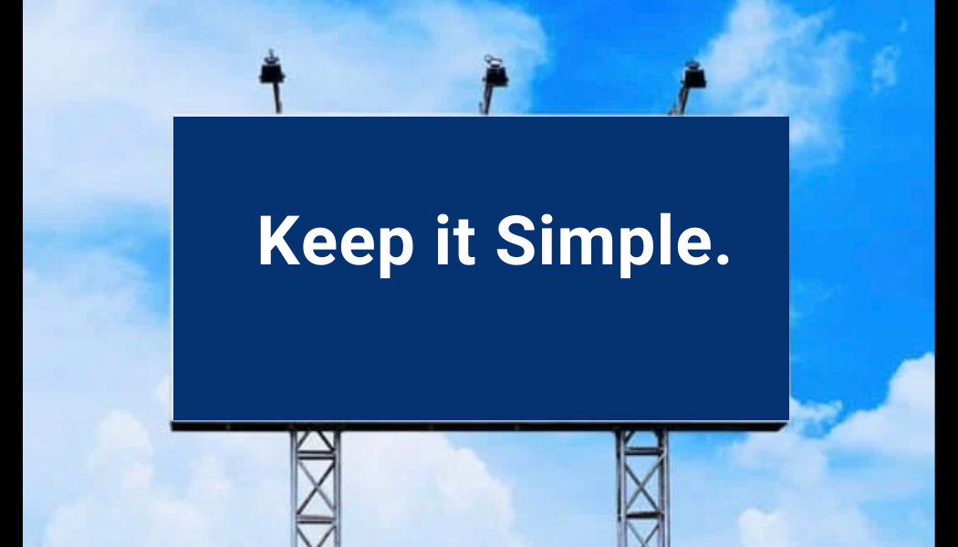
Simple Design
Outdoor advertisements should be straightforward and to the point. Go with one main creative idea. In many cases, billboard ads are used to suggest what your audience should be doing or where they should be going. Keep the message simple, and you’ll get a better response. Our audience is mobile, and that makes the exposure time typically four or five seconds. Say it loud and say it clear in seven words or less is a great rule of thumb to go by.
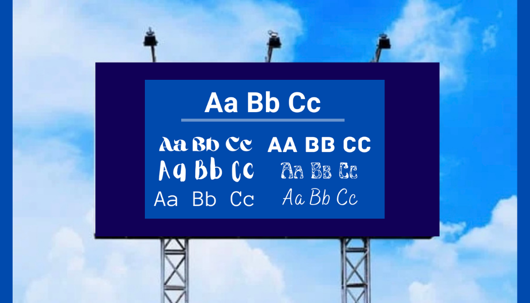
Readable Fonts
Select fonts for outdoor ad designs that are easy to read from variable distances. Use large, legible typefaces. Ornate fonts or fonts with narrow strokes will be difficult to read. Correct spacing between letters, words and lines will enhance visibility. Words with both upper and lower case letters are easier to read than all uppercase letters.
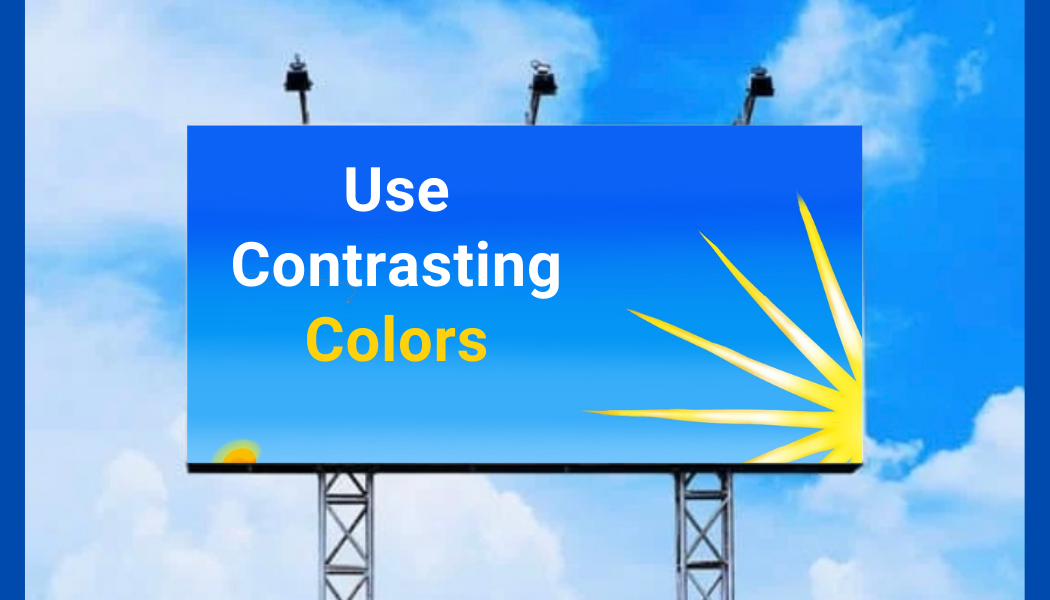
Contrasting Colors
Color can affect the success of an advertising campaign. Research shows that high color contract can increase outdoor advertising recall by 38%. It is advised to choose colors with high contrast in hue and value. Low contrast colors will blend together visually and make the message harder to understand Contrasting colors are easier to see from greater distances.
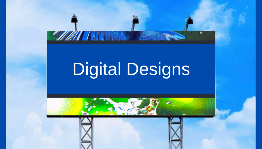
Digital Billboards
The same basic design tips apply for digital billboard design. Solid white backgrounds on digital billboards tend to look subdued or muddy and do not appear vibrant on digital billboards. The technology used in digital billboards is responsible for this effect. The outstanding advantage to using digital billboards is the flexibility. You will be able to change your message weekly, daily or even hourly. Using multiple design layouts enhances the your creative strategy to communicate numerous details.
